.png)
Maximizing Function and Form: The Basic Design Rules You Need to Know.
- Kerry Snyder
- Jan 18, 2024
- 4 min read

When it comes to design some principles and elements make it or break it. These are tools and rules to make a great design. I want to go through some of the main rules and tools of design in hopes of making your next project a success. This list doesn't go into depth. The point of this blog is to give a small portion for beginners. I want to begin with small bites of information at a time. In this blog I listed the elements of design as well as the basic principles.
The Elements of Design.
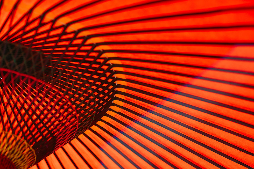
1) Texture: Texture gives an image/design depth. It gives it a visual feel. It can give the visual thickness or a 3D appeal. Texture is a great source to give your mind the sense of touch with your eyes. Does it look sticky? Rough? Does it look soft or squishy? Those are the questions that texture can answer in your design.

2) Line: Line is an interesting element. A line can make a big difference in graphic design. A line can be used as art but also as a way to divide spaces. One of my favorite visuals is images created by a continuous line such as animals, people, and objects.
3) Color: Out of all the elements Color is the most powerful element. The main purpose of color is to catch attention. Too much color can overpower the whole design. A pop of color can bring the design to life. Color has different uses and needs to be studied by itself. Most artists and graphic designers learn color theory. That is another topic for another day.

4) Shape: Shape or form as some call it can come in two different types. One is organic shapes which are more natural. These are shapes found in nature like clouds, trees, and other living things. Inorganic shapes are more geometric and do not appear in nature such as a square, circle, etc.

5) Size: Size is important because it gives content a rank in importance. Some call that volume. The more important information is bigger. For example, the title of this blog has three different sizes. The title being the main way to catch attention is the largest. The second is the subtitle that gives the reader what the content is about and then the paragraphs that contain the information are the smallest.

6) Space: Space is required and needs to be accounted for when you create, evaluate, and put your works together. If there's no space the viewer won't be able to know what's important and what isn't. To put it to terms... It would look like a hot mess.

7) Value: Value is the different tones from light to dark. I best learned how to use Value when taking a drawing class. Drawing in pencil gives you only one option. Your drawings needed to use light and dark strokes to make the picture stand out or fade. If the whole drawing was one value, it would be impossible to tell the differences in the shapes of the image.

This is a very bare minimal view of the elements of design. Each one can have a paragraph and examples on their own. But for now, these terms will give someone new to design words to describe what is seen. Having a vocabulary to use to describe a design will make it easier to discuss it with others.
Principals of Design
These are the "How?" in design. The principals give rules to follow to help keep designs clean and visually pleasing. Though, one of the things I learned while going through school is sometimes you can break the rules and still come out with a beautiful design.
1) Focal point/ Emphasis: Every design needs a focal point. This is what gives a viewer a sure place to look. There must be only one focal point in a layout. Anything can be used to create a focal point. Say you are writing a paper. Your title would be the focal point. In a photograph, the subject would be the focal point. The subject is the first thing you want the viewer to see.

2) Contrast: Contrast helps create interesting layouts and it avoids dry boring design. Space can be used as a contrast between the positive and negative spaces. (Filled and empty spaces)

3) Balance: Balance gives the feeling or impression of equality in weight or importance by how the elements in your design are arranged. They can be arranged symmetrically or asymmetrically to create that equality. When all the elements are on one side and empty space is on the other, the design doesn't look visually pleasing. The goal of design layouts is to be visually balanced.

4) Pattern/Rhythm: Pattern of elements like shapes, lines, or colors creates an interesting visual design. It is used in a lot of different ways. Think of it as the drum beat of your art.

5) Harmony: Arranging elements to create a coherent whole will give the feeling of belonging. This makes all parts work together. This is also called unity. You want all your designs to be unified.

6) Movement: The purpose of movement in design is to control the eye's flow throughout the design. There are four movement elements that can be created. They are horizontal, vertical, diagonal, and curved.

These are just a small portion of the design. Everyone can be a good designer. Learning how the different elements can work together in art will give any design a leg up. The best part of art in any form is that it's subjective. What one person finds to be brilliant may be so so to someone else. Whatever the case, learning these basic elements and principles has improved the flow of my designs.
Comments